So the folks at Kaleidescape recently released the Strato K, which plays back content that they’re branding as “4K Cinematic.” The advantages of 4K Cinematic are that a) it has a higher bitrate, and b) it has higher chroma resolution.
The advantages of bitrate are well understood, and I don’t think need any explanation. But I’ve seen a lot of misunderstanding of chroma resolution. I think this is going to be easiest to explain with some visual examples, so I wrote a few scripts to manipulate the chroma in some sample images, and hopefully that’ll help.
So, uh, you keep saying “chroma” like I’m supposed to know what that means
Let’s start off by explaining what chroma is. If you’re a computer-literate
person, you probably think about display color as RGB — that is, red, green,
and blue values for each pixel. Me too. I’ve spent enough time writing CSS
(which expresses color as #rrggbb) that I can pretty much guess what color
something is going to look like just from seeing a hex code.
But movie people are weird[1], and don’t do it that way. They represent pixels as YCbCr. The “Y” there represents luma, how bright the pixel is; if you’re converting from RGB, Y is a weighted sum of the RGB values, heavy on the G because human eyes are very green-sensitive. (Why does “Y” represent luma instead of “L”? See footnote above.) Cb and Cr represent chroma — each is a number that represents how far the pixel is pushed toward, respectively, blue and red. They pull from the R and B values in RGB if you’re converting.
There’s nothing magic about YCbCr vs. RGB. They’re different numbers, but you can do basic arithmetic to convert between them. Ultimately, they both just specify what the pixel looks like on the screen with the same potential output.
To illustrate the difference between luma and chroma, here’s a test pattern I put together with a script. In RGB terms, there are four values in here: A bright red, a dark red, a bright blue, and a dark blue.
But in luma/chroma terms, it has two luma values (bright and dark) and two chroma values (blue and red), combined together. The YCbCr values here are:
| Color | RGB | Y | Cb | Cr |
|---|---|---|---|---|
| Bright red | #FF4949 |
127 | −31 | 91 |
| Dark red | #B60000 |
54 | −31 | 91 |
| Bright blue | #6F6FFF |
127 | 72 | −12 |
| Dark blue | #2626B6 |
54 | 72 | −12 |
In addition to the main image, I’ve added a version of this image showing just the luma (i.e., just the Y value, with Cb/Cr at 0) and one with just the chroma (i.e., just the Cb and Cr values with Y set constant).
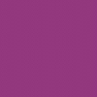

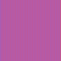
It’s hard to see the patterns in those images, so here’s a section of them blown up 4x to make the pixels easier to see.
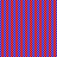

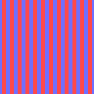
I made this pattern so that you’d clearly lose something when you strip away the luma or the chroma: Luma gives you a checkerboard pattern, chroma gives you vertical stripes. Put ‘em together, and you have a vertically striped checkerboard.
Okay, so what’s chroma resolution then?
We know that the resolution of the image is the number of pixels in the image, right. The magnified square has 48x48 big ol’ pixels, each with both a luma and chroma component. It’s at full resolution for both luma and chroma.
What if you downscaled the image so that it was 24x24 pixels — half as wide and half as tall, so 1/4 of the original resolution? Well, in order to do that, you’d average out[2] a block of four pixels (in a 2x2 square) down into one pixel. This is what you’d do to turn a 4K image into a 1080p one, for instance.


Now, because of the way I’ve constructed this image, each block of four pixels contains one pixel of each color (dark red, light red, dark blue, light blue), which means that… they’re all the same, and the low-res “1080p” version of this grid is just a block of solid mid purple:

But it’s possible for luma and chroma to have different resolutions. And here’s a fun fact about the human eye: It sees luma detail a lot better than it sees chroma detail. So when folks were looking at how to save bandwidth on video, they realized that you can downsample chroma to 1/4 resolution while leaving luma intact — basically 4K luma with 1080p color. Because video people are weird[1], they call the image with downsampled chroma “4:2:0” while the full resolution is “4:4:4” — there’s also “4:2:2”, which reduces chroma resolution horizontally but not vertically.[3]
Here’s what that looks like in our image. (Because of how our image is constructed, with each row nearly identical, 4:2:2 would look the same as 4:2:0, so I’m not showing it here.)

This downscaling gets us the blending effect that we got from downscaling the whole image for the chroma component — no more stripes — but it keeps all the luma detail, so the checkerboard remains.
So… 4:2:0 is kind of a disaster?
For worst-case test patterns, sure is! But most people rarely watch movies about red and blue checkerboards, and real images compress down somewhat differently. Let’s take a look at an actual photograph.[4]

Here’s the luma and chroma split out:


Notice that pretty much all of the detail — the feathers, the grain of the wood, the eye — is in the luma. The chroma is mostly big flat patches of color. Which means there isn’t much detail there to lose when we cut it to 1/4 resolution:

And if we put those back as 4:4:4 and 4:2:0, here’s what we get:

Yeah, I can’t tell those apart. As they say on TV: “Zoom in! Enhance!”
Let’s blow up the head 4x, where there are some thin, sharp color edges — the red ring around the eye, the red at the throat, the line between blue and yellow:


There’s a difference here, and if you look carefully maybe you can see it, but you’ll have to look really carefully. (The bottom of the red on the eye is where I see it most easily.) It’s maybe more obvious if you look at just the chroma component isolated without all that distracting luma detail:
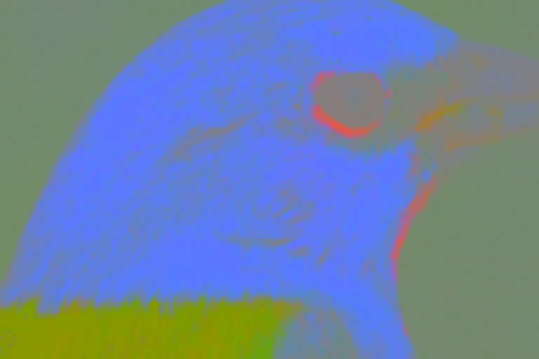

The edges of the color regions get stair-stepped into 2x2 blocks — but because the luma is still full resolution, the eye reads the sharp edges from that and mostly doesn’t notice the color is a little sloppy. For fun, here’s what the image looks like with full-resolution chroma and downsampled luma. The discerning eye will notice that it looks much, much worse.

So yeah: The takeaway here is that chroma subsampling genuinely is throwing information away, and that full 4:4:4 genuinely will look better than 4:2:0… but the difference is going to be very subtle, and it’s an open question whether someone would notice it if they weren’t carefully pixel peeping. There’s a reason 4:2:0 is in wide usage.
Where do the richer and more saturated colors come into this?
Nowhere! Reviewers of the Strato K often refer to Cinematic videos as possessed of “richer colors” or say that the image is “more vivid and saturated.” But what you just saw above is the entirety of what chroma resolution is. There is no way for it to ever cause the colors to change across large areas — the only possible delta in any image is around the edges of fine detail, and it just involves the colors bleeding into each other for a pixel or two.
So why are people saying that 4:4:4 images have deeper, richer colors? Well, there are three possibilities:
- There’s something wrong in their system. Because 4:2:0 is nearly universal in video, their home theatre system might switch into a different processing mode if it gets a 4:4:4 signal, which could change how the image is rendered. This still shouldn’t change the color, but if they’ve only calibrated one of those processing modes, it might have the effect of changing the color, since now they’re viewing some of the images uncalibrated. (There are a lot of complications around how HDMI represents the pixels that make this less likely than it sounds, but it’s possible.)
- There’s something wrong with the content. The “Cinematic” 4:4:4 (or 4:2:2 on some content) files get served by Kaleidescape from a literally different file than the 4:2:0 version. It’s possible that Kaleidescape could have screwed up their encoding very badly in one of these versions but not the other. This would be shockingly messed-up, though, and I don’t think it’s likely. I include the possibility here just for completeness.
- Placebo. As the Brunching Shuttlecocks once put it, placebo is so effective that it’s the standard by which everything else is measured. When people know that they’re getting something with better “chroma resolution” and they don’t know what chroma resolution is, they’re prone to imagining differences in color that don’t exist.
I don’t know which of these factors explains any particular reviewer’s mistakes. (For the ones who have video evidence of it, I lean more heavily toward the first option.) But these are the choices.
Okay, they’re probably not actually that weird. The real talk here is that movie people were dealing with this stuff before powerful computers did everything, and so they started from a base of analog systems where the different ways of handling things are more natural. I suspect there’s actually a really fascinating essay on the topic of why video ecosystems work the way they do, tracing the evolution of the technology from projectors through videotape and CRTs to today’s modern digital video systems. But this is not that essay; in this essay, I’m just gonna shrug and call it a mystery. ↩︎ ↩︎
There are other, more sophisticated ways to downscale images, and to upscale them, but averaging is a common way and makes it easiest to understand the principles here. ↩︎
Since we’re throwing in terminological asides: Downscaling the chroma is also more commonly called chroma subsampling. Each pixel is a “sample” and we don’t have as many samples of chroma as we do of luma, so it’s subsampled. ↩︎
The photo is from the U.S. Fish & Wildlife Service, via Wikimedia Commons, and is in the public domain. The original is a 4:4:4 JPEG at 4572x3078; I cropped it and scaled it down to 768 wide, so every pixel here has genuine full-resolution color to start with. All the images on this page are lossless PNGs, so the only chroma subsampling in them is the stuff we’re doing on purpose. ↩︎
